Project: Brand Character, Packaging Design
Client: Landor Associates
Creative Director: Jason Carter
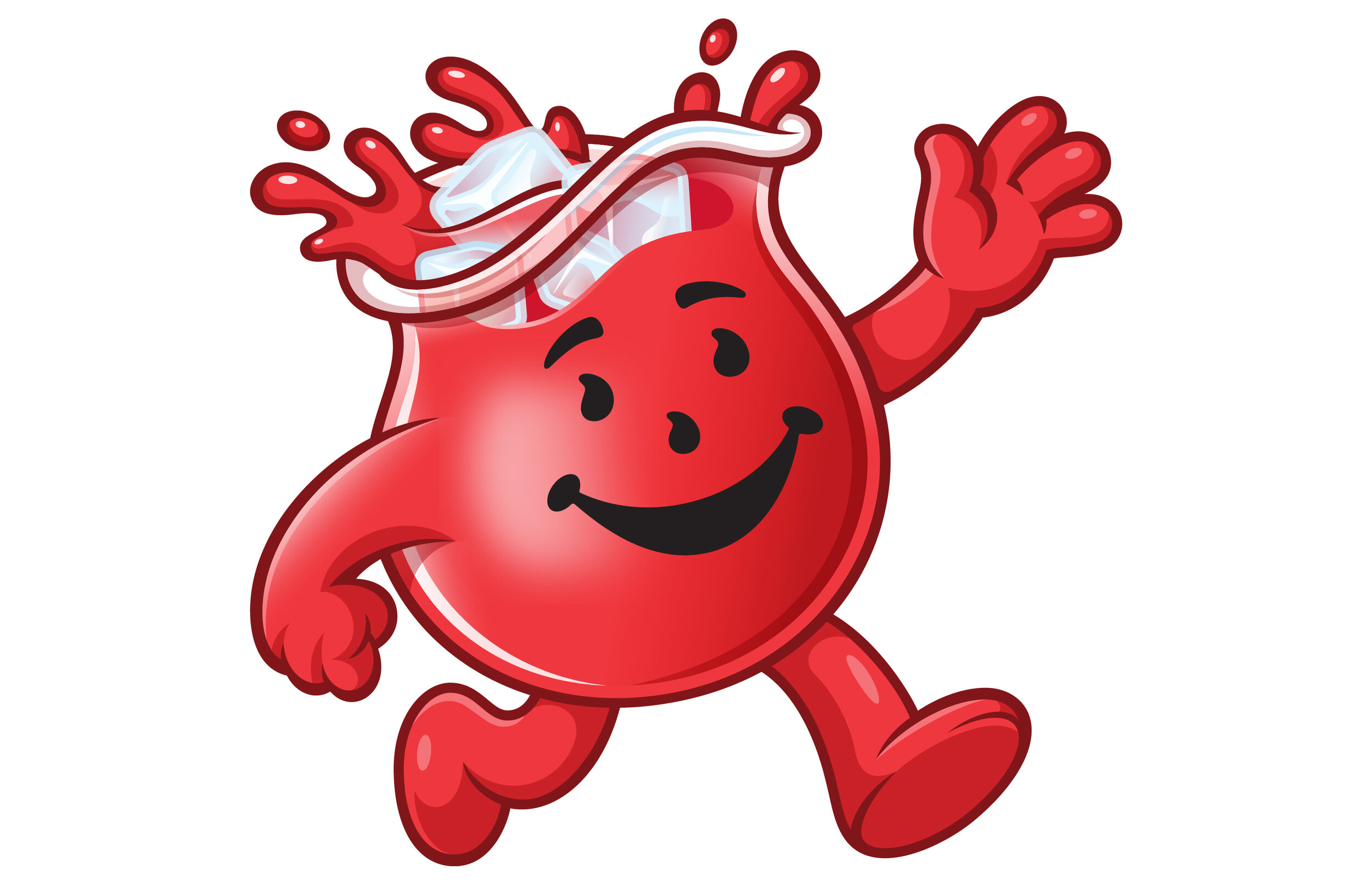
We collaborated closely with the Kool-Aid team to infuse a playful and imaginative spirit into their product line packaging. Furthermore, we revitalized the iconic KAM (Kool-Aid Man) brand character, infusing his personality with even more fun and transforming him into a flavor adventurer for a new generation. Oh Yeah!
Kool-Aid
Kool-Aid Man Brand Character.
Additional Kool-Aid Man Poses.
Kool-Aid Man Sour JAMMERS Poses.
‘Galactic Grape’ Kool-Aid JAMMERS.
‘Watermelon’ Kool-Aid JAMMERS.
‘Blue Raspberry’ Kool-Aid JAMMERS.
‘Orange Escape’ Kool-Aid JAMMERS.
‘Cherry Blast’ Kool-Aid JAMMERS.
‘Strawberry Kiwi’ Kool-Aid JAMMERS.
‘Paradise Punch’ Kool-Aid JAMMERS.
‘Mango Peach’ Kool-Aid JAMMERS.
‘Kool-Aid FREEZE POPS’ Packaging Illustration.
‘Kool-Aid BURSTS’ Packaging Illustration.
Spot Illustrations for Kool-Aid Flavors.
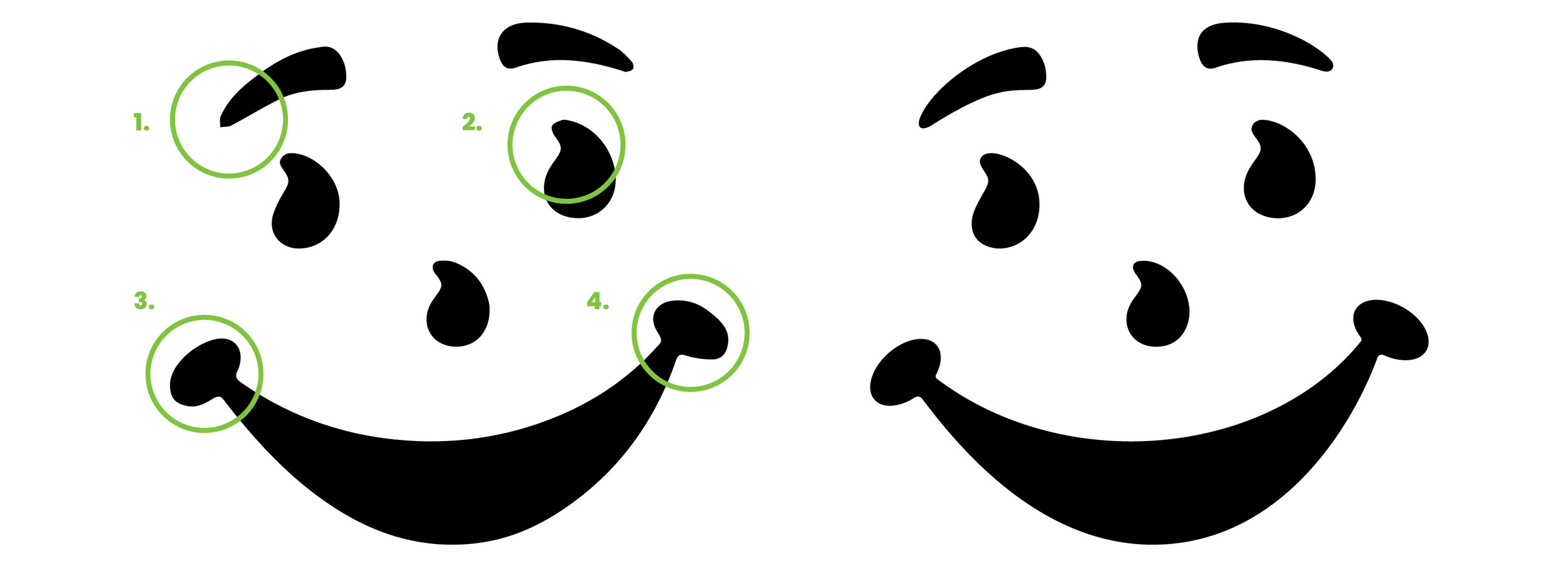
Kool-Aid Face Lift
Improved Kool-Aid Face Art
We re-created and cleaned up the Kool-Aid face art. The new artwork retains the equity of the famous motif and fixes the broken bezier curves and improving the overall continuity of the shapes.
Original Kool-Aid Face Art
The legacy Kool-Aid artwork was image traced at some point, causing the vector art to look sloppy. For example, several areas within the design contained broken anchor points and bezier curves.
1. Broken Bezier Curves
The end curve in the eyebrow is broken and not rounded, this truncates the shape and forms a sharp point.
2. Broken Bezier Curves
The apex of the eye shape is clunky since the anchor point isn’t smooth but rather a corner anchor point.
3. & 4. Wobbly Shapes
Someone scanned and image traced old art resulting in a crude profile instead of clean elliptical terminals on the smile shape.


